Provided art direction and graphic design for teenage acne site. Designed look for website, downloadable wallpaper, screensavers, electronic and print postcards.
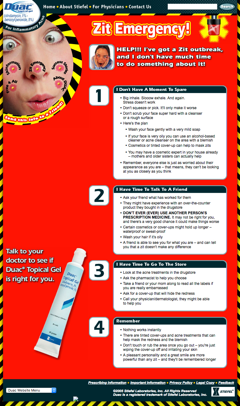
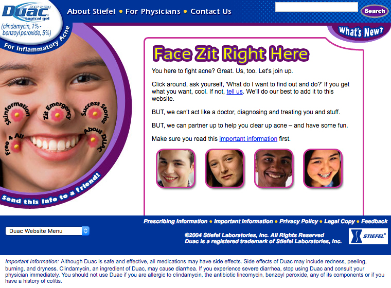
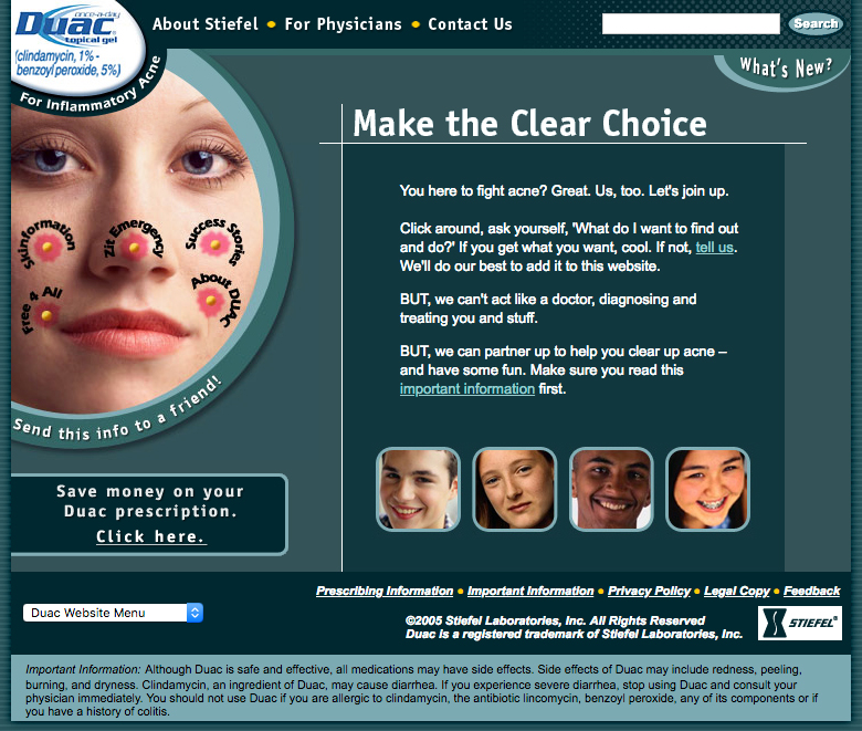
The various sections of the site were navigated via the “facenav” — buttons on a face which resembles pimples. Upon clicking a “zit button”, it seems as though the pimple were exploding onto the screen. As the user navigates through the site, “zit buttons” for sections previously visited “clear up”, with only the name visible.
Worked with team including Creative Director, Developer and Account Executive. A focused, strategic approach was applied to the website’s development. The site concept and design were informed by insights gleaned from interviews with teenagers, combined with client business goals.
Website went through one “facelift”. Look of site was updated to reflect client’s new brand and print campaign.
Created artwork and page templates.
Awards:
Gold Rx (2004)
Bronze In Awe (2005)
“A Dose of Reality” was an interactive feature to help teens associate various thought processes with a particular emotion. When visitors hovered the cursor over the “Is This You?” section, the appropriate emotional state would appear in the “Then Acne Is Causing…” area to the right.
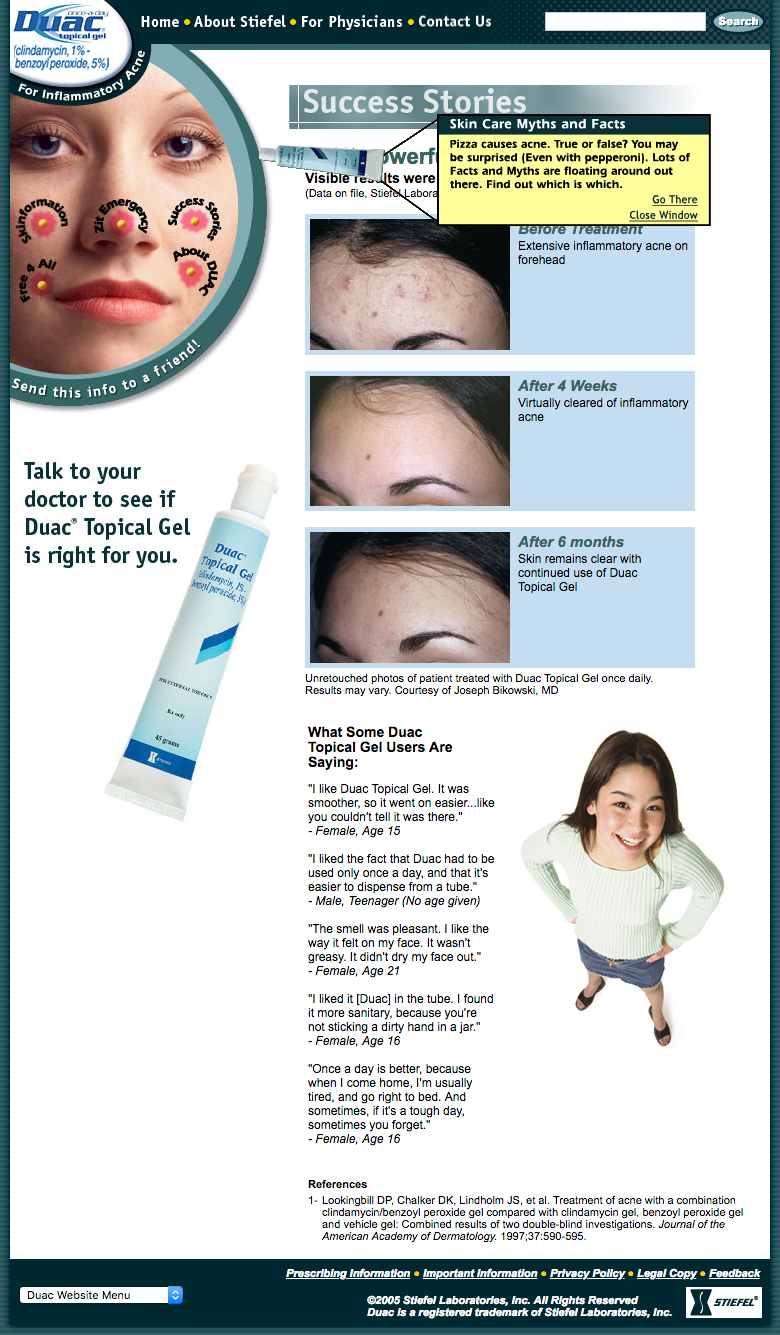
The Duac site also included “flyover” notifications that provided information or “fun facts” that directed visitors to a specific section. A variety of flying Duac tubes appeared, depending upon the page. The goal was to create a lighthearted user experience while teaching about acne.
When visitors arrived at the “Zit Emergency” page, javascript code would briefly “shake” the browser underscore the implied emotional state (anxiety) with an extra layer of fun.

The original site design sported bright blue, purple tones. It was replaced with a new color scheme after the client updated the visual branding.


